
Nearly every team in the Barclays Premier League this season has a shiny new home jersey to parade in front of their fans and hopefully sell loads of them before their season unravels and their fans' dreams die a death.
We've seen most of them in the first weekend of the season, but now it's time to once and for all settle the argument that not that many people are having by determining which club has the best home jersey in the league.
We're factoring everything into account from sponsor aesthetics to sleeves, so without further ado, he's our list:
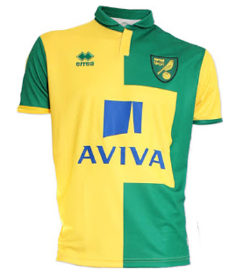
#20 - Norwich City
AVIVA! Hey did you know that Norwich were sponsored by AVIVA? Well, if you didn't, Norwich are sponsored by Aviva. Just in case you managed to miss that fact, they sponsor takes up about 80% of the surface area on a shirt that is ugly anyway.
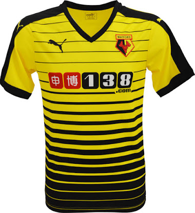
#19 - Watford
A Borussia Dortmund reject from the Puma factory floor, this one would have been much nicer if the black lines weren't so think, and the sponsor doesn't help either although it's not as bad as some on this list.
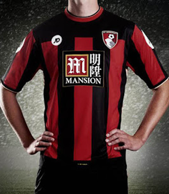
#18 - AFC Bournemouth
Giving JD Sports the call to actually design your team's shirt was a bold move... It didn't really come off. There's a lot going on, but that sponsor... Hideous.
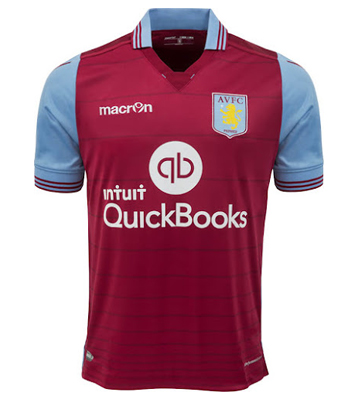
#17 - Aston Villa
A very uninspiring effort from Macron who have removed the nice pinstripes from last year, and the club have added a new, bigger sponsor. A poor showing.
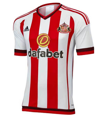
#16 - Sunderland
We're getting into the mid-table now with some seriously average shirts. That Dafabet logo is unsightly, and the trim on the sleeves and neck lets down this effort.
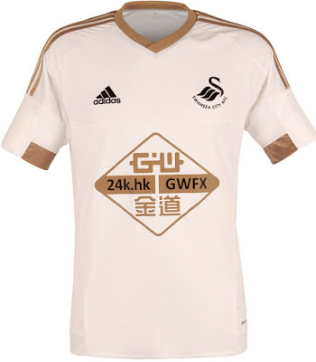
#15 - Swansea City
An otherwise fine jersey yet again ruined by a massive sponsor. The copper sleeves/neck look a bit cheap but it looks much better on the players, apart from that logo which simply does not.
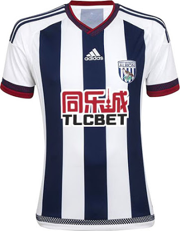
#14 - West Bromwich Albion
The trend of massive ugly sponsors seems to also coincide with Asian sponsors, as WBA would have been higher on this list were it not for the sponsor.
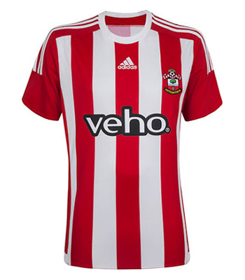
#13 - Southampton
The sponsor is better here, but there's nothing really going on from this Adidas teamwear template. The away jersey far outshines this one, look out for that ranking soon.
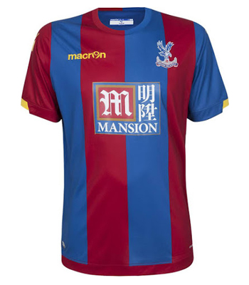
#12 - Crystal Palace
An ugly Mansion logo that we've already complained about on this list is all that separates Crystal Palace from being Barcelona circa 07/08.
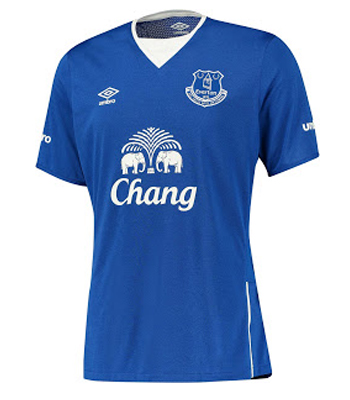
#11 - Everton
This is another one that looks better on the players than it does in a photo, that neck design is eye-catching but overall it's a solid simple effort from Umbro.
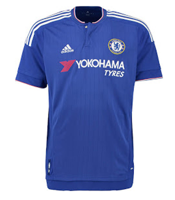
#10 - Chelsea
Chelsea have taken a downgrade in both the overall design of their jersey and the looks of their sponsor this year. The faded lines of last season were very nice, as was the simple Samsung logo, and we're just not sold on this effort from Adidas, although it's certainly not bad. Bang in the middle.
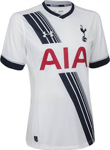
#9 - Tottenham Hotspur
It hasn't changed, but it's still a good enough looking jersey to make our top ten. The sash is quite cool, a good showing from Under Armour.
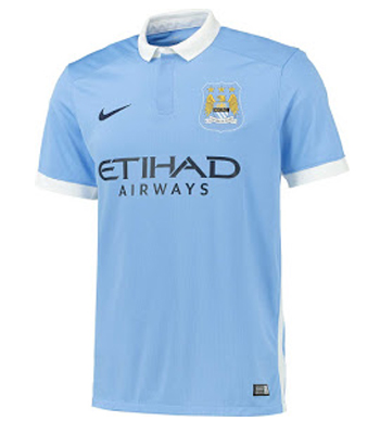
#8 - Manchester City
We're getting into the good ones now, as this simple City jersey will no doubt be a big hit with the clubs fans, but there's just too little going on for it to make our top five.
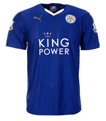
#7 - Leicester City
The gold crown on the King Power logo and the Puma logo actually add to this jersey for us, this is a good looking jersey.
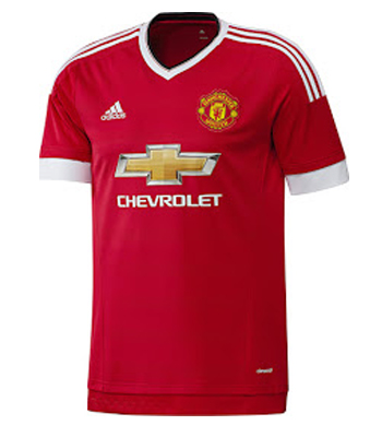
#6 - Manchester United
The sales figures for this jersey since it's launch at the beginning of the month suggest the folks at Adidas are currently having a money fight, and to be honest they've done well with their first jersey back with Man United.
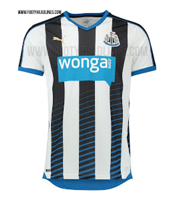
#5 - Newcastle United
If the horrible WONGA sponsor was something different, we would be looking at a top three spot. Take the sponsor away and this is an absolutely sublime effort from Puma, what a shame.
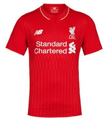
#4 - Liverpool
New Balance are the polar opposite of Warrior, and this new Liverpool home jersey is a really tidy design. It's simple, and a bit different with the pattern on the front. Their nicest for a few years.
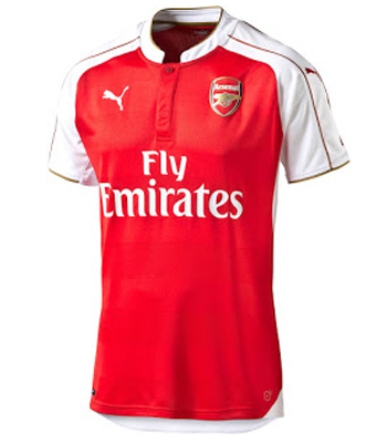
#3 - Arsenal
The new Arsenal jersey is a touch of class. The gold trim on the white sleeves is a lovely touch, and the sponsor isn't offensive. More white on the shoulders is a good thing, even if it is a little less traditional.
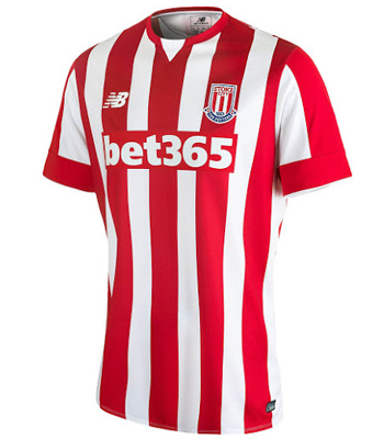
#2 - Stoke City
An absolute mile ahead of the other red and white striped jerseys, New Balance have been able to make Stoke stand out with subtle lines inside the red stripes and they look great. The sponsor actually looks good here, and the jersey looks fantastic in the flesh. Simple and classy.
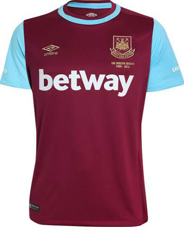
#1 - West Ham United
West Ham's new anniversary jersey is beautiful. Our one tiny gripe is that the sponsor is a bit large, but it's just white text, and it doesn't take away from the simplicity of this cracker. The sleeves, the neck design, it's a winner of a jersey and it's won our Premier League home jersey power ranking.


