
In the vast gamut of sports fashion there have been many successes and failures. The problem with sports fashion and in particular jerseys, is that when it comes to the sportswear of your club is that you are stuck with whatever designs they cobble together. This can mean that from time to time you end up looking like an utter pillock because of some ill thought out, gaudy experiment.
Here are the 12 shite sports jerseys that people nevertheless wore in their droves.
Ireland - 2008 Home
The curse of the orange strikes again. See how it crudely bleeds down each side? Keep it green, that's what I say.
Liverpool - Various
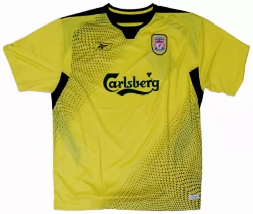
If it's the colour of a highlighter pen then it's not a good jersey.
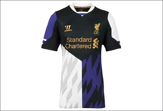
What were they even going for here?
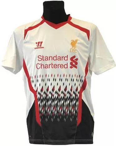
If it looks like a printer test page, it's not a good option.
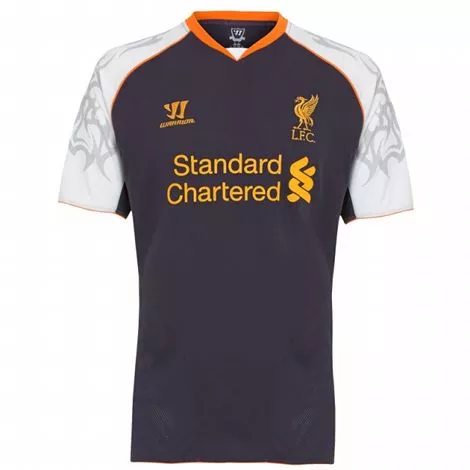
Hang your head in shame Warrior...
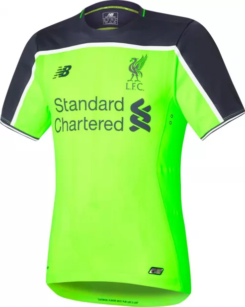
I should have just done a separate post about Liverpool, shouldn't I?
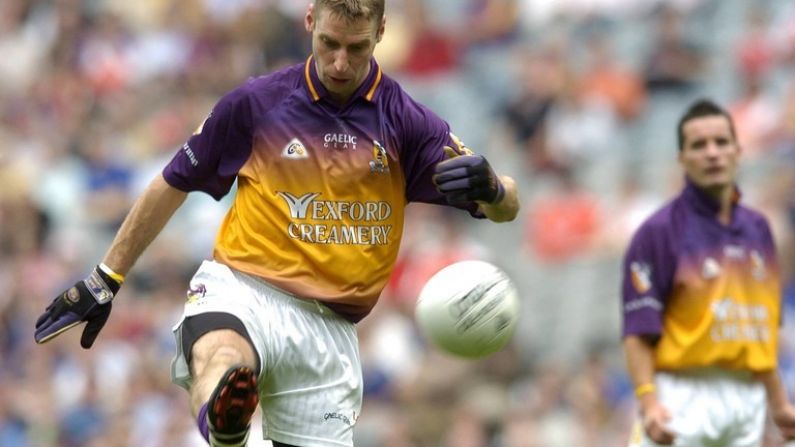
Wexford - 2005
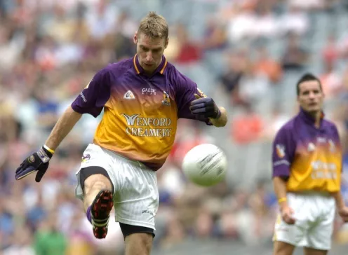
You have to sympathise with the Wexford kit makers. Purple and gold are hard to mesh together successfully. Yet the makers didn't heed this advice when trying to bleed the two colours into this confused mess.
Barcelona - 2012/13 Away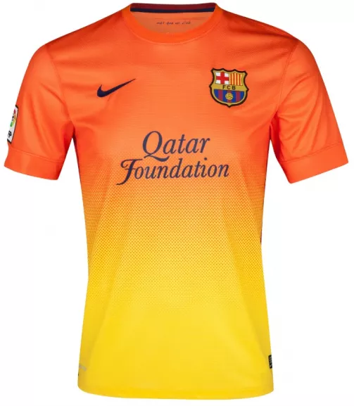
Looks looks hideous. Yet Barca could release a jersey in scutter brown and it would still sell in the thousands. Reminds me of a calippo.
Real Madrid - 2014/15 Away
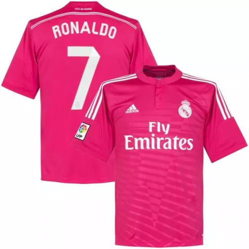
Again the highlighter rule applies here. Now if Real Madrid weren't so goddamned popular this jersey wouldn't even be here but alas, every CR7 wannabe had this effort in their closet.
Man United - 2017/18 Third Kit
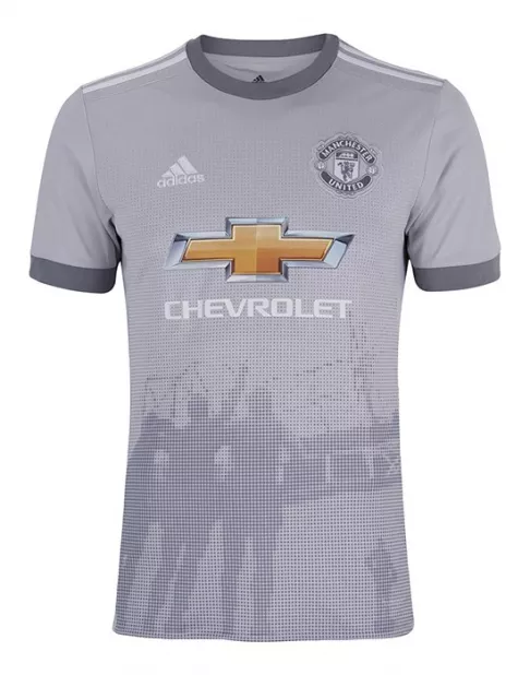
Images on jerseys never fare well and this jersey is no exception. It's a pity because sans halftone it would be a pretty nice addition to any United fans' collection.
Dublin - 2004 Home

Dublin's 2004 effort has far too much going on in it. Taking a page out of the Wexford playbook they blending their county colours, more successfully it has to be said but there's still something off about the jersey as a whole.
International Rules - 2004
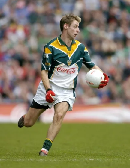
This effort has no sense of identity. They makers opt for dark green an Australian shade of yellow and totally overcomplicate the design. Yet these jerseys were everywhere when they came out. Go figure.
Celtic - 2008/09 Away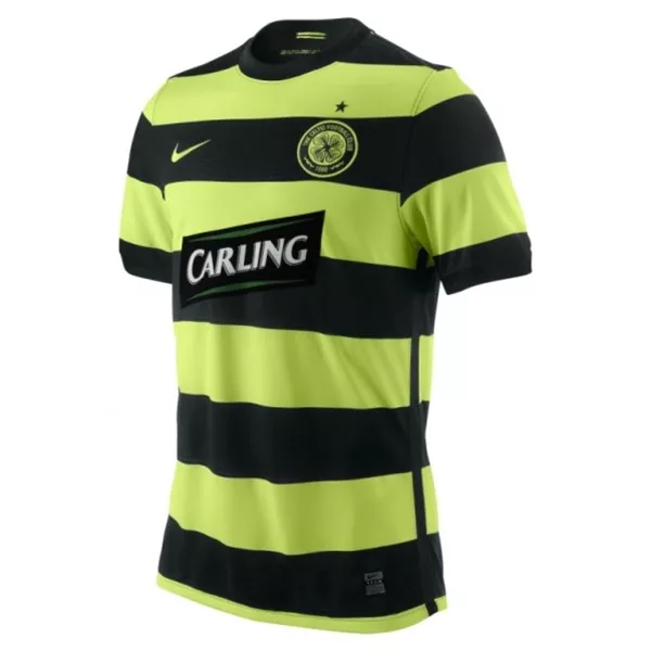
Toxic. Unless you like looking like a nuclear bumblebee.
Chelsea 2007/08
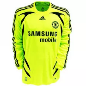
A glorified training bib.