
Initially, we thought that Zenit St Petersburg and the Daily Mail had quite a lot in common, given both institution's aversion to immigration and equality.
Today, however, has seen a wedge driven between both parties. In a bid to entertain/annoy you on your lunch break, the Daily Mail online ranked their top ten ugliest football badges:
Wolfsburg's club crest is dreadful... where does it rank in our top 10 worst badges? https://t.co/mQ4M8f5jmh pic.twitter.com/KPnS7tWbds
— MailOnline Sport (@MailSport) April 12, 2016
There is one important thing to note here: this is an utterly preposterous selection, with the Napoli and Hamburg crests among the most beautiful in world football. Newell's Old Boys should also not be included, although for an admittedly childish reason.
Zenit were affronted by their inclusion, and deployed Photoshop to shoot back in fantastic fashion:
.@MailSport Here are our ten worst newspaper badges ever. pic.twitter.com/vhTnlnxQnn
— ФК «Зенит» (@zenit_spb) April 12, 2016
The Mail then went on to explain their selection:
.@MailSport Honestly, we preferred your old one too. pic.twitter.com/O9avzzO6SS
— ФК «Зенит» (@zenit_spb) April 12, 2016
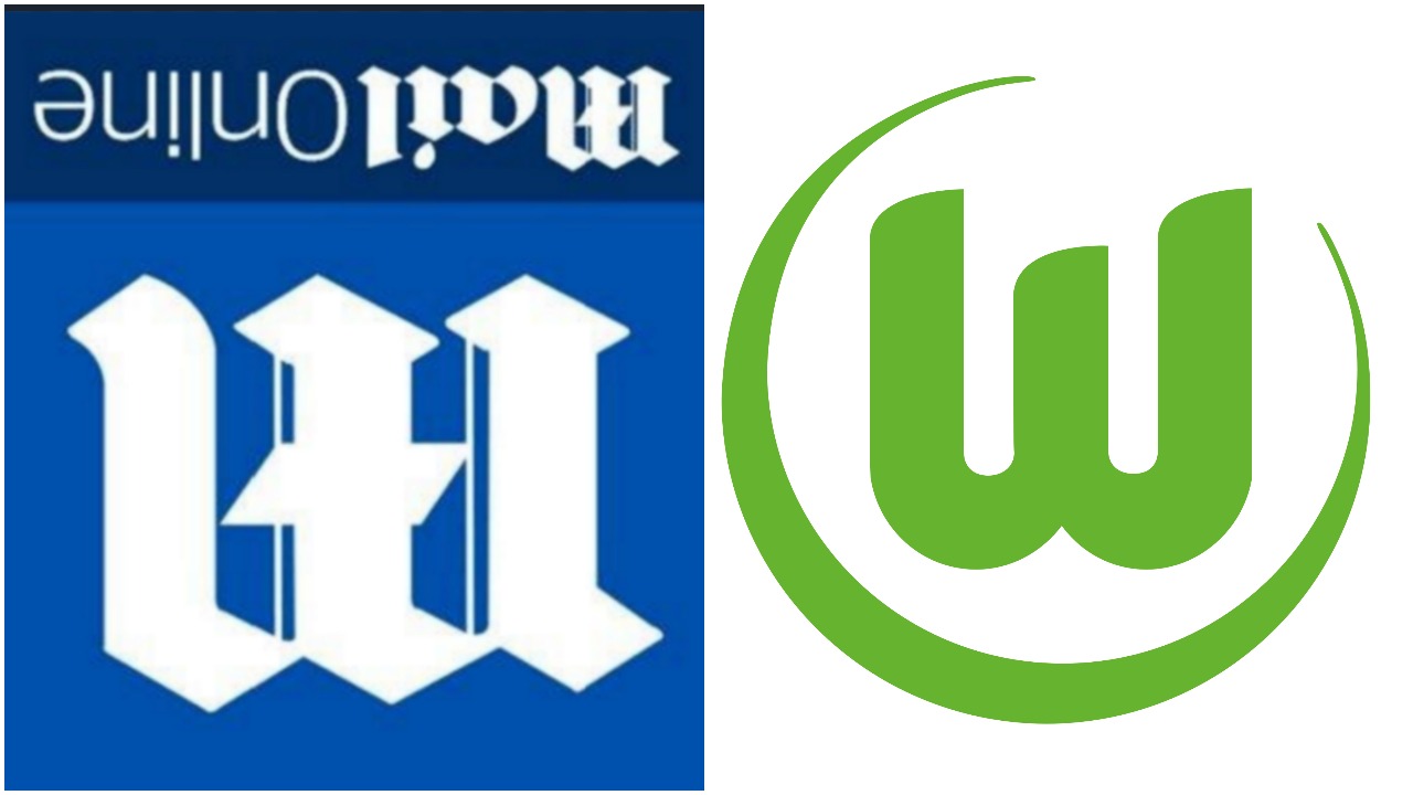
It is either an act of crass contradiction or a quite brilliant subversive act by the author against the Mail to write that Wolfsburg's crest is so hideous, given that it looks quite like the Mail crest turned upside down:
It is a worthy post, but they've got it totally wrong. They have not, for example, included the Hereford United crest:
The bull on the crest even looks depressed to be part of the thing. You can read the full Daily Mail list here.


