
After bringing you a ranking of every county's 2022 home kit, it seemed only natural that we would have to rank this year's away GAA jerseys as well before the 2022 Championship is done and dusted.
With the All Ireland Hurling and Football Finals set to take place over the next two weeks, we have seen some absolutely amazing jerseys on display over this year's GAA calendar...with a few exceptions.
In the case where no away jersey was designated, we have used the goalkeeper jersey. This is usually what counties do in such cases.
Here's what we came up with.
32. Westmeath
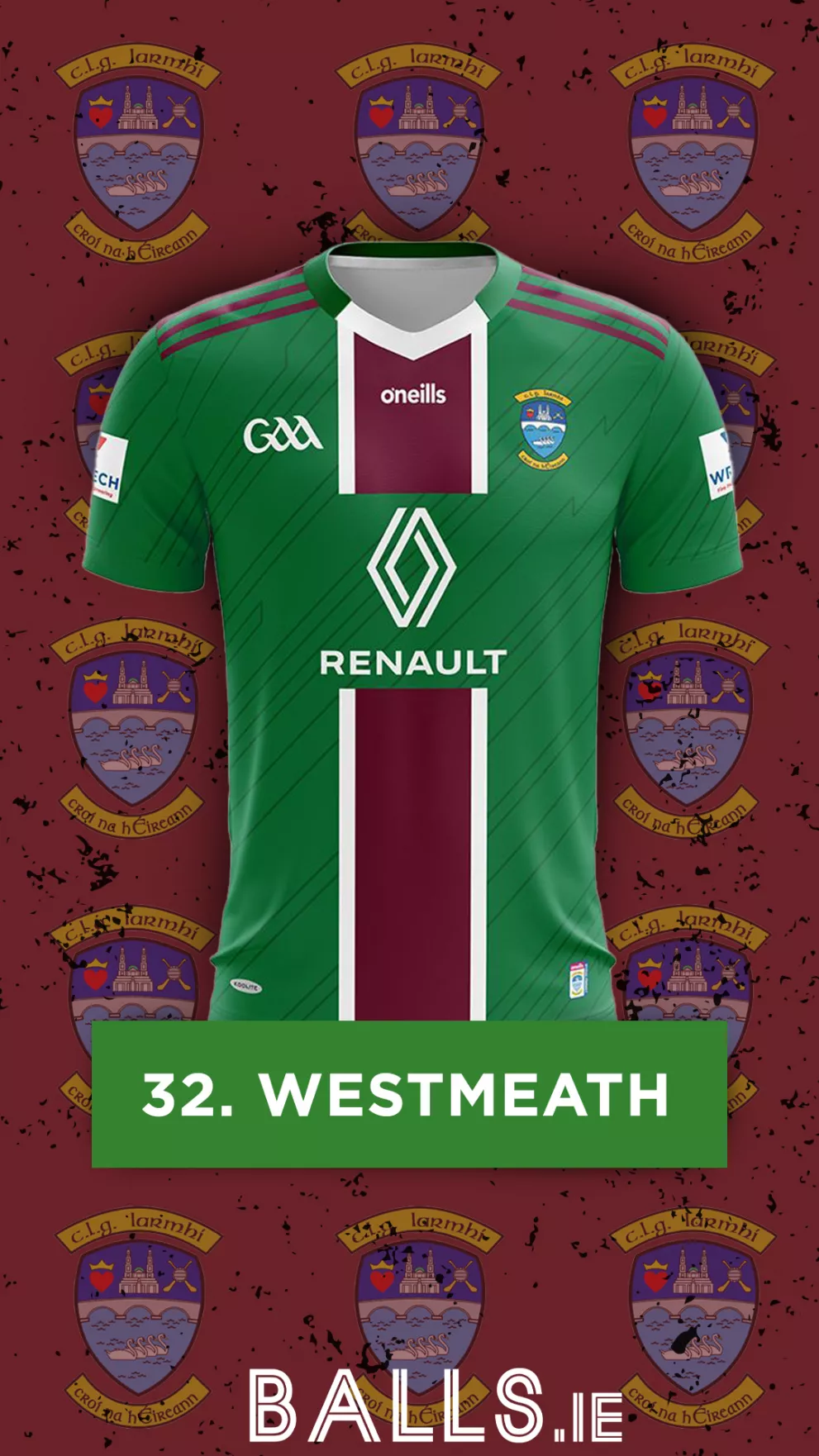
After topping our list of best home jerseys, all Westmeath had to do was release something simple and effective to create a classy pair of jerseys. Unfortunately, they elected to do the exact opposite and come out with this strange green and maroon concoction. We’re not entirely sure what they were going for, but this one sits rock bottom of our rankings.
31. Laois
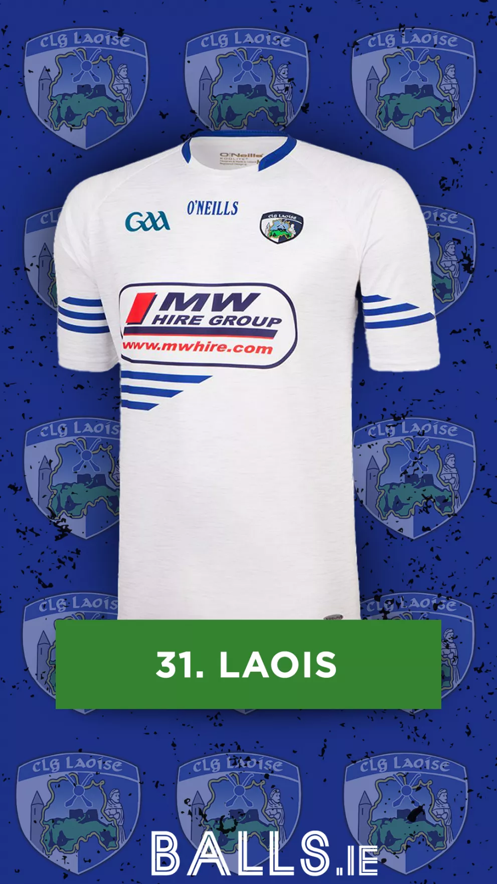
Something about the three stripes being randomly thrown in the middle of the jersey just makes Laois’s effort for this year look unfinished. Accompanied by a plain white base with the presence of a big logo, this jersey doesn’t hit the heights of previous Laois entries.
30. Longford
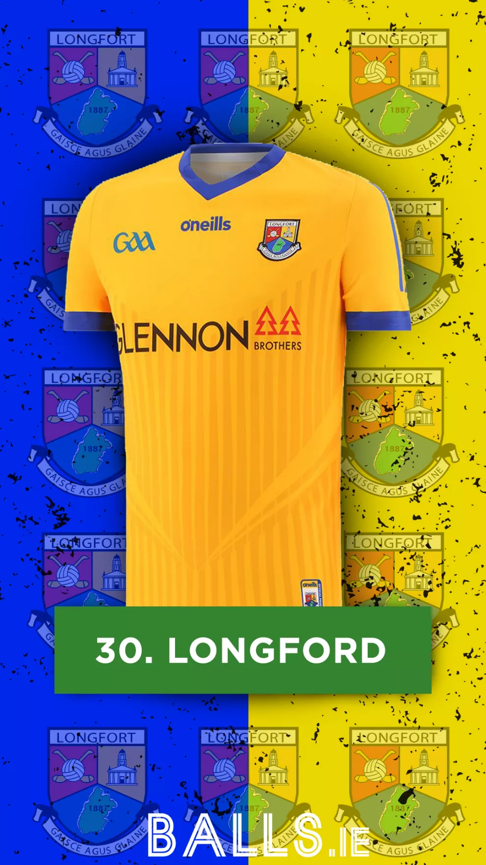
While it’s definitely an improvement on their last away jersey, Longford continues to suffer from some unimaginative flair that would make their jerseys more visually appealing. Ditching the fully blue sleeves was a masterstroke, and the pattern definitely gives the jersey a sleeker look, but this one still falls short when placed against its competitors.
29. Carlow
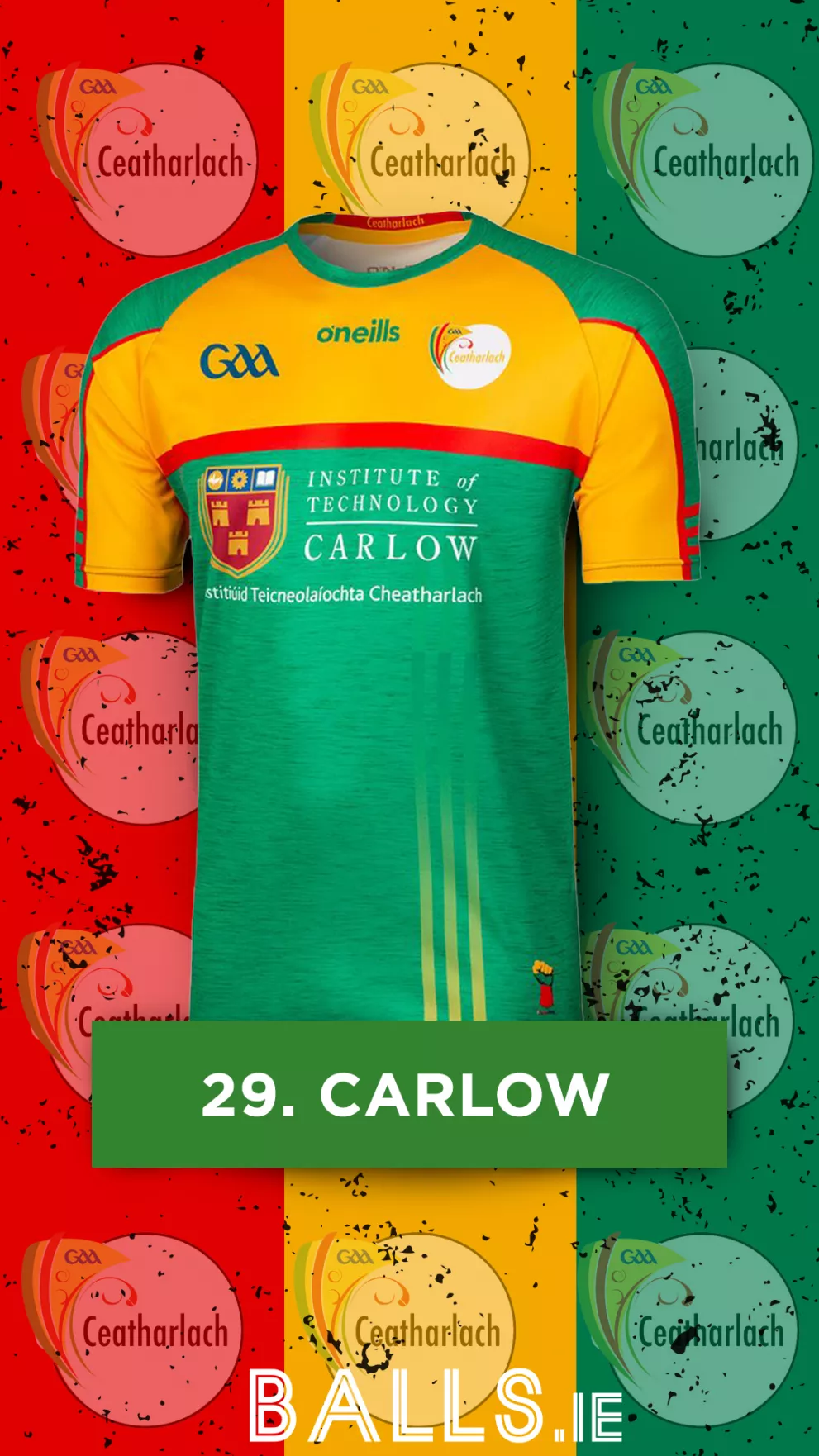
While this one is ranked slightly higher than their home jersey, Carlow still sit at the latter end of our list. It's undeniable that trying to get a solid design with this colour combination is difficult, however after years of jerseys falling short of the mark, you’d think Carlow would’ve finally hit the target at least once, unfortunately for them, they haven't done that here either.
28. Leitrim
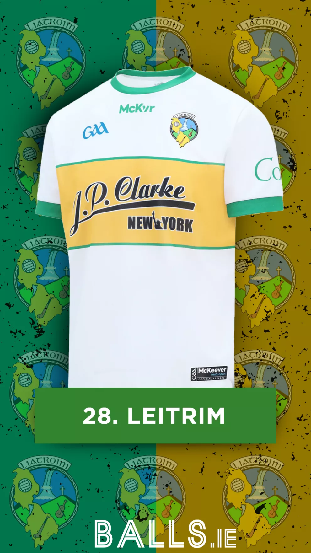
While this is a fresh approach to the standard yellow away number Leitrim usually opt for, this jersey just feels overly bland. The presence of some undertoned patterns or design could’ve elevated this to a much higher position, but a plain white base just leaves the jersey with an unfinished look.
27. Sligo
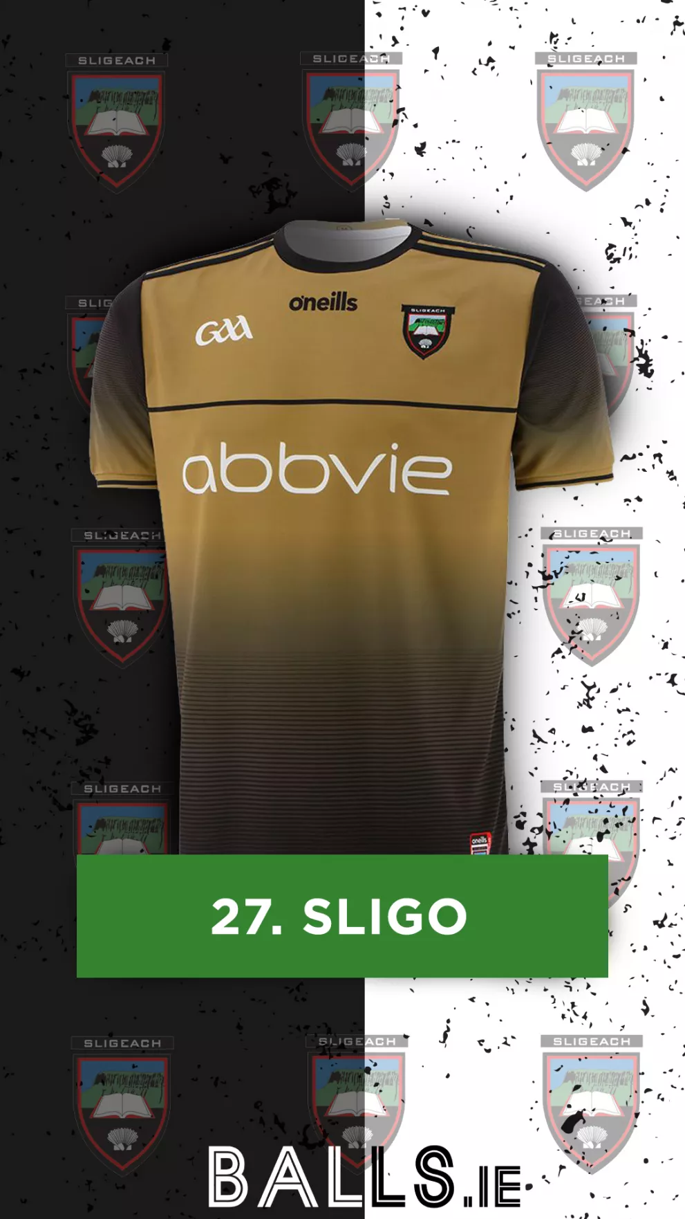
Sligo’s decision to stray away from their red and black combo at first seems intriguing... then you learn what they’ve replaced it with. This brown/gold combination with the black just doesn’t mix well at all. The random black line across the chest along with the white sponsor just seem to be thrown on without much thought behind them. While this jersey did have potential, it falls well short.
26. Clare
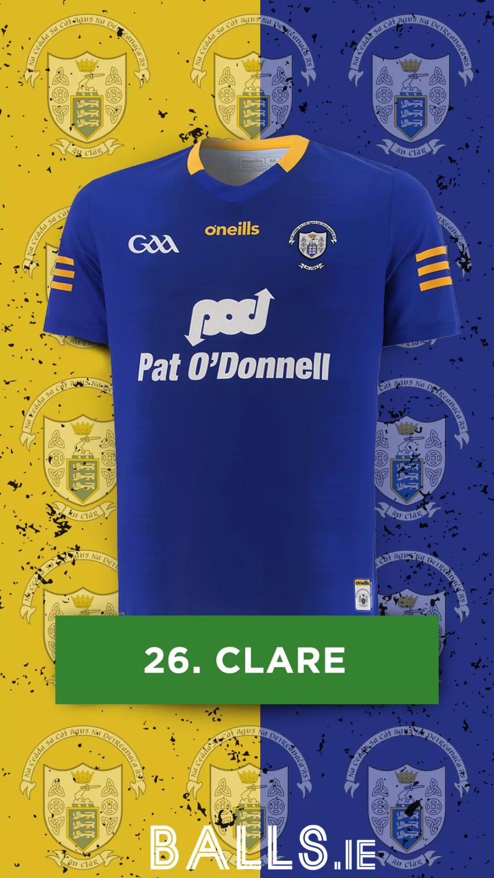
Clare once again suffers from an overly simplistic template. The sponsor, GAA logo and crest all being white does rescue it somewhat, giving the jersey a more cohesive and finished look. However, this dark blue number feels somewhat uninspiring and definitely gives the impression that Clare’s away jersey had so much more to give had it seen some small design tweaks.
25. Meath
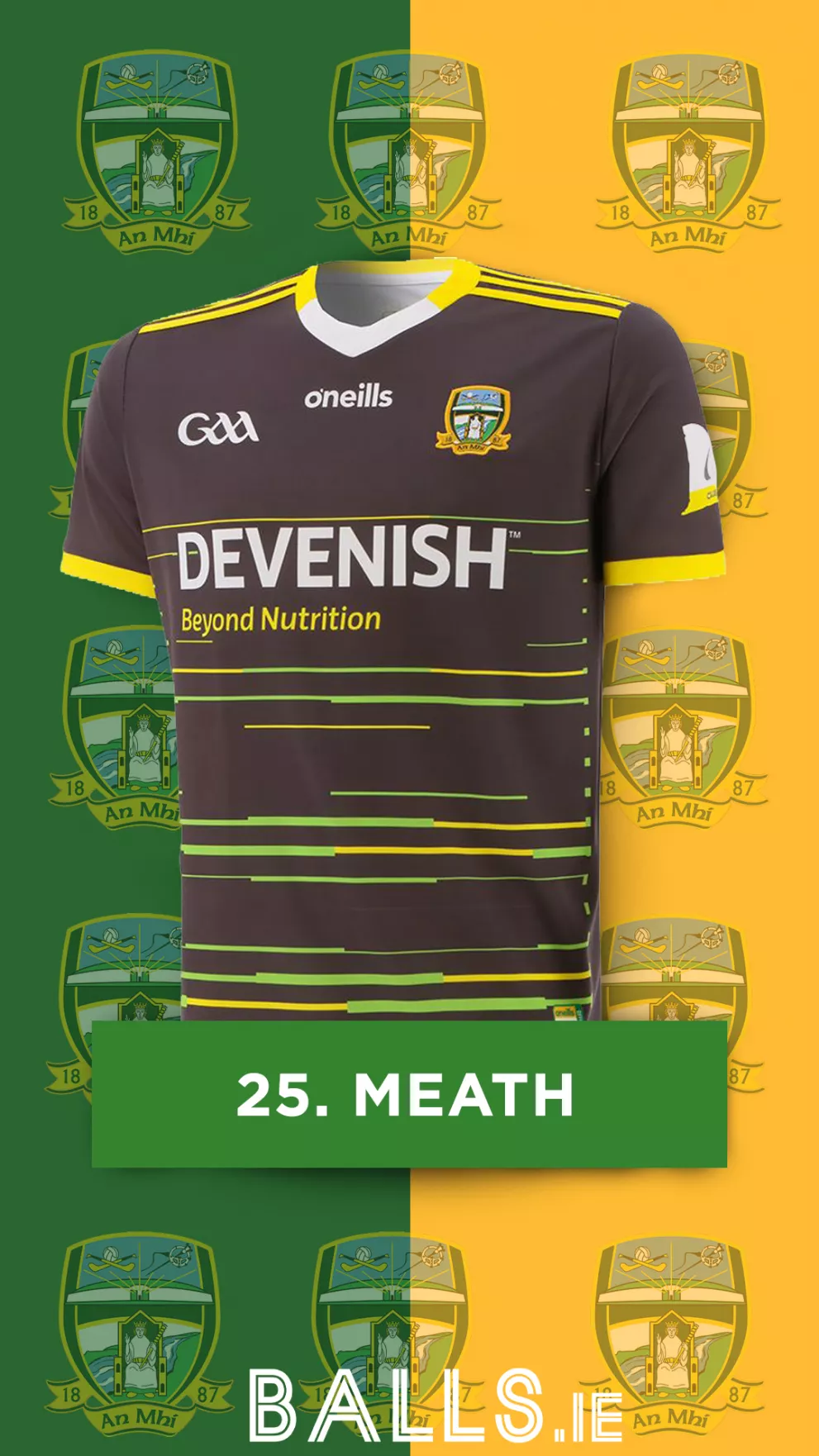
Much like Sligo, we’re not sure why Meath opted for a dull colour as the base of their jersey, unlike Sligo however, it does feel slicker and more stylish. The combination of the green and yellow streaks ties it back to their home jersey nicely. However, we can't see past that strange brown-greyish base, and we can’t rank Meath any higher!
24. Derry
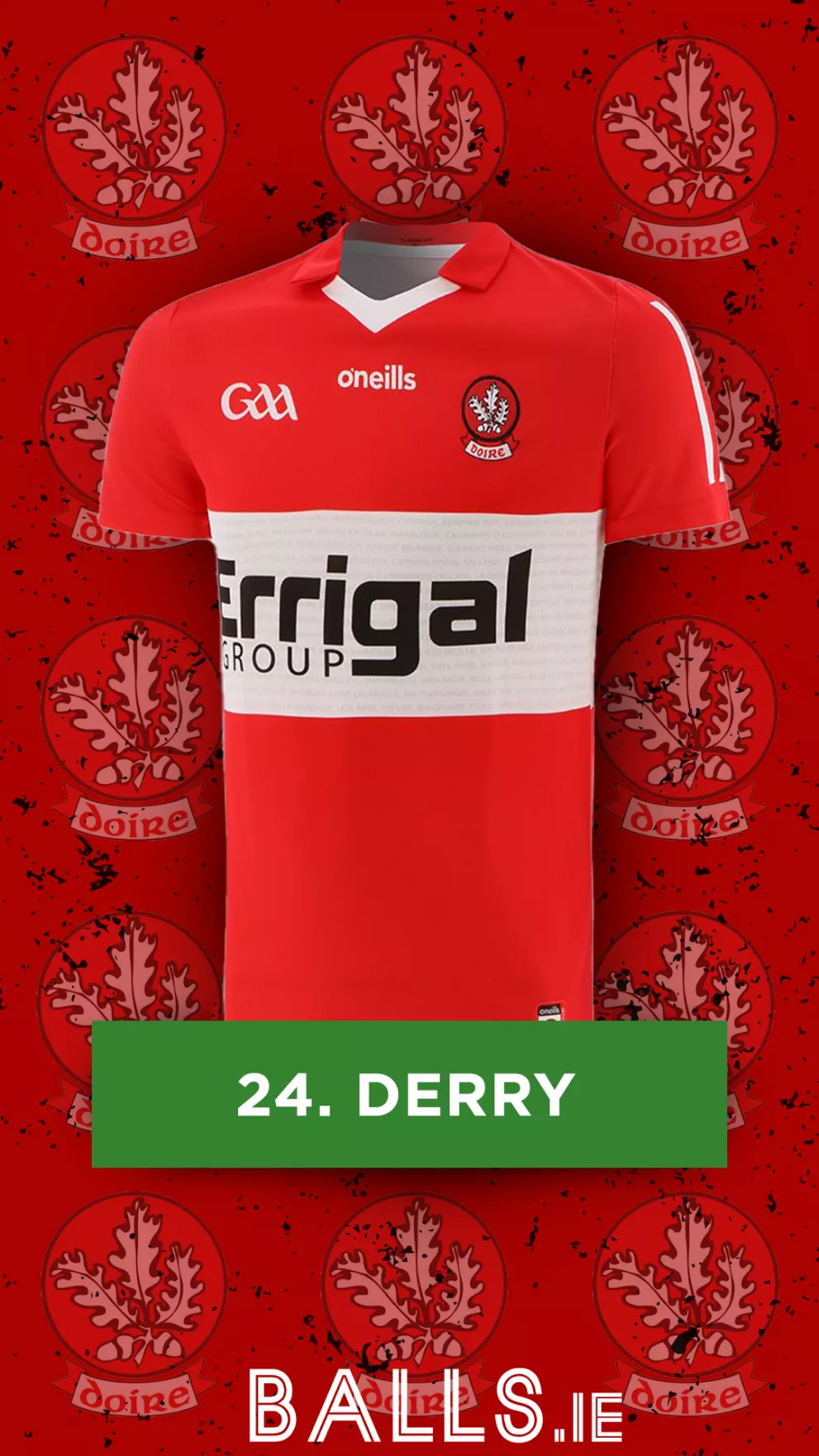
Much unlike their Championship run this year, this is a boring and uninspired entry from Derry. The collar is a nice touch, along with the boxed-off look of the sponsor as opposed to it just being thrown on there, but Derry suffers from what so many of these away shirts do, and that is the over-reliance on a plain base colour.
23. Down
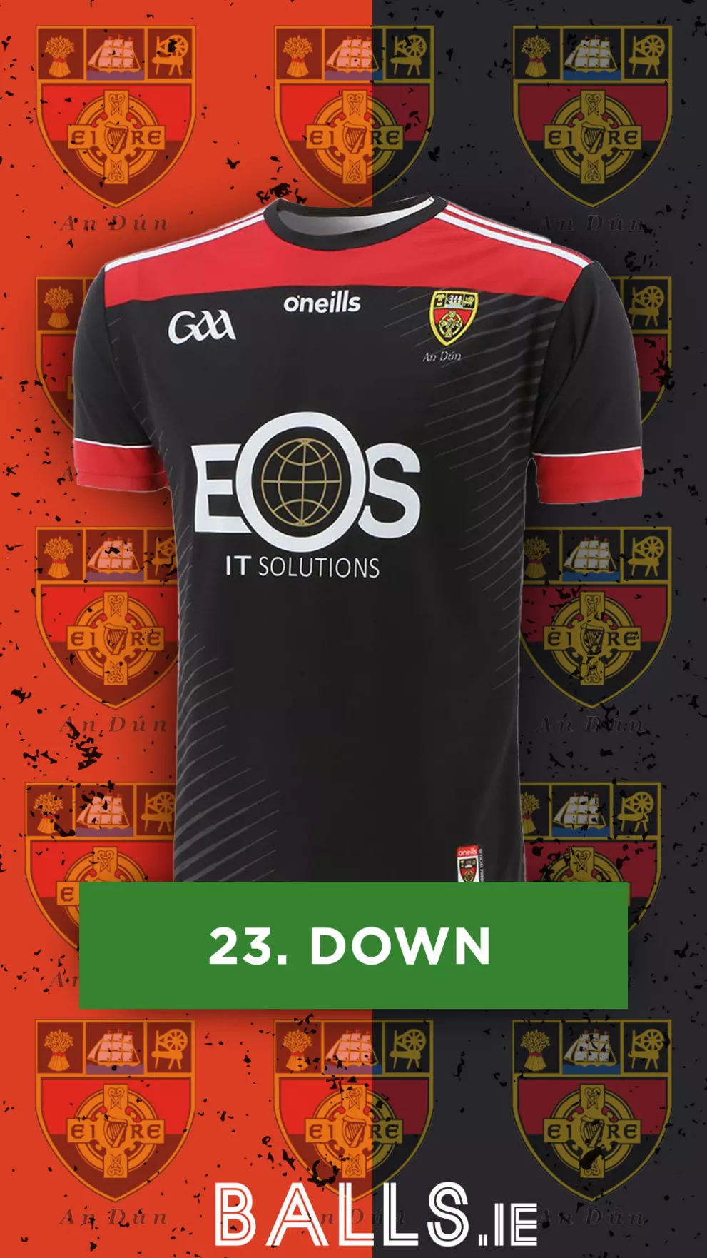
The grey stripes on the black base give much added detail to this down jersey. Accompanied by some well positioned red panels, the jersey comes together nicely, however when compared to their previous light blue entry last year, this one feels like a significant step backwards for Down, and our ranking for them reflects that.
22. Armagh

There’s definitely something to be said for the slick, blacked-out jersey, we’re just not sure Armagh are saying that however. The lack of any stripes on the shoulders or down the side does oversimplify this jersey. The idea was definitely good, but the execution just needed a few subtle changes to really secure a high spot on our list.
21. Monaghan
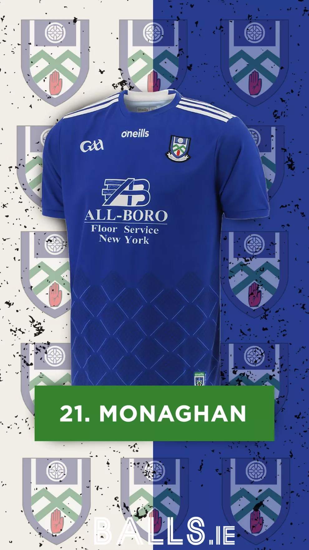
While there isn’t anything overly poor about Monaghan’s away jersey, it falls down on the fact it’s simply the inverted version of the home jersey. The design at the bottom, along with the white on their crest being cohesive with the sponsor, stripes and various logos bring the whole shirt together nicely, but unfortunately, we can’t see past this being the home jersey with a makeover.
20. Cavan
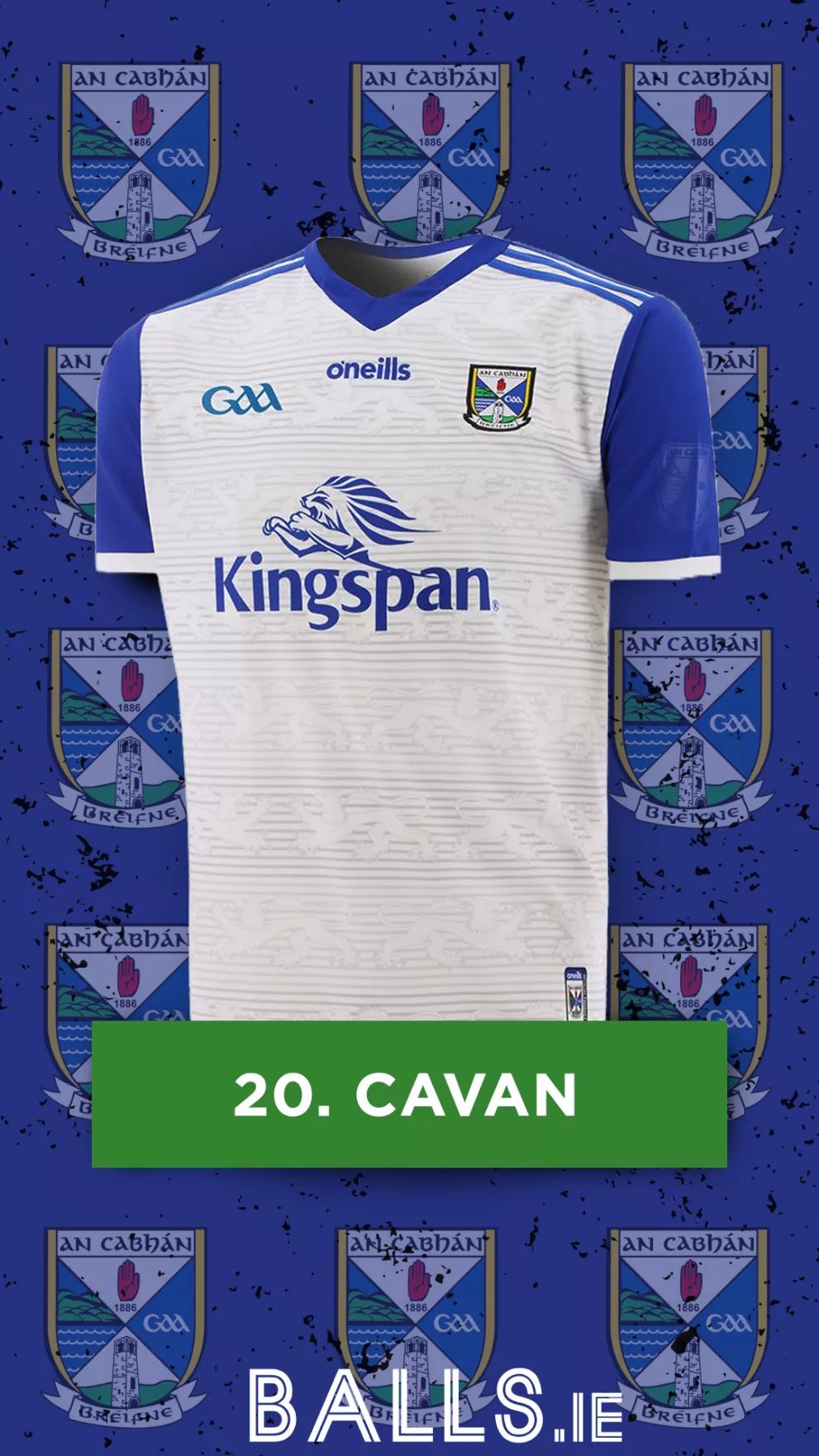
The addition of the fully blue sleeves is a real change in direction from Cavan’s usual fully white away outfit, however, we have to say we preferred the predecessor! The lined design with the lion outline does work nicely with the sponsor, and makes the jersey stand out from the other plain white ones, but given Cavan’s previous away jersey pedigree, we had no choice but to drop them down the rankings with this year's entry.
19. Fermanagh
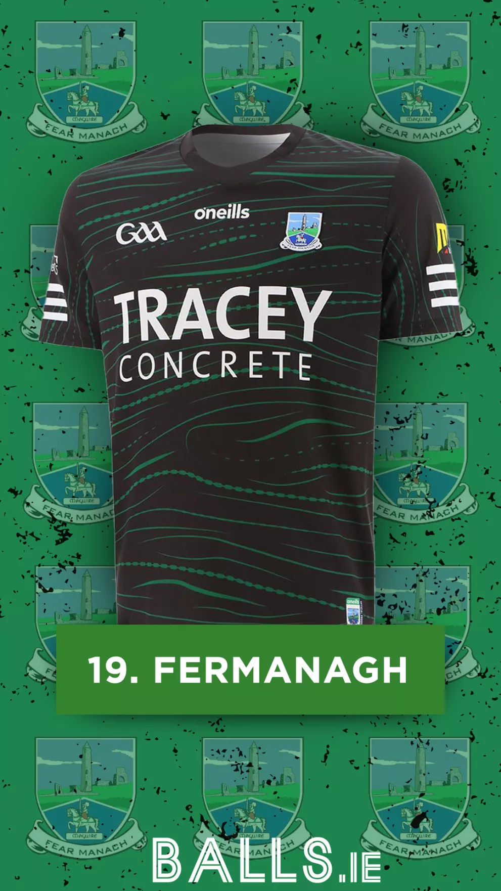
This is definitely a shift in direction from their standard white jersey! Fermanagh’s choice to go with this colour combination, along with that pattern is definitely a step in the right direction! It's definitely one of the more adventurous jerseys on this list, however, it does look a bit like a training top, and for that, we have to sit them at 19th!
18. Tyrone
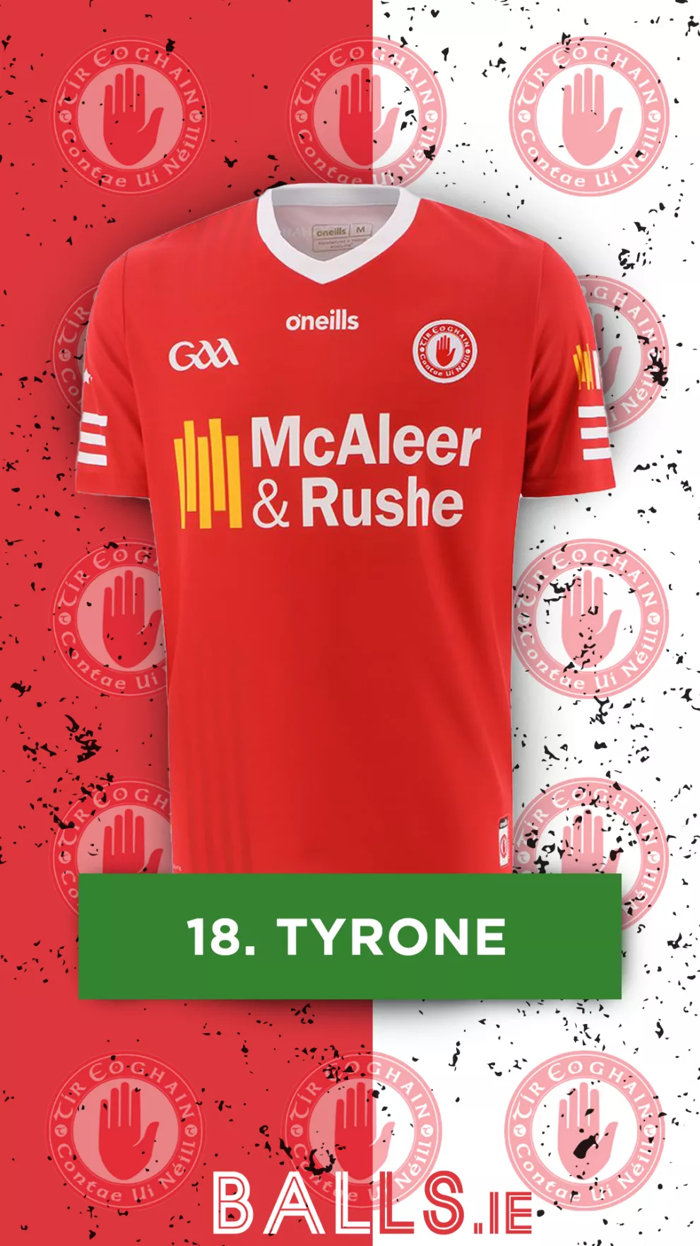
Much like Monaghan, Tyrone falls victim to using the exact same template as their home jersey. The jersey comes together well with their crest, and the small details on the left do make it pop more than a boring red jersey. However, having a strong history of away jerseys, this one feels a little lackluster when compared to those that came before it, and for that, we had to knock it down in our list.
17. Limerick
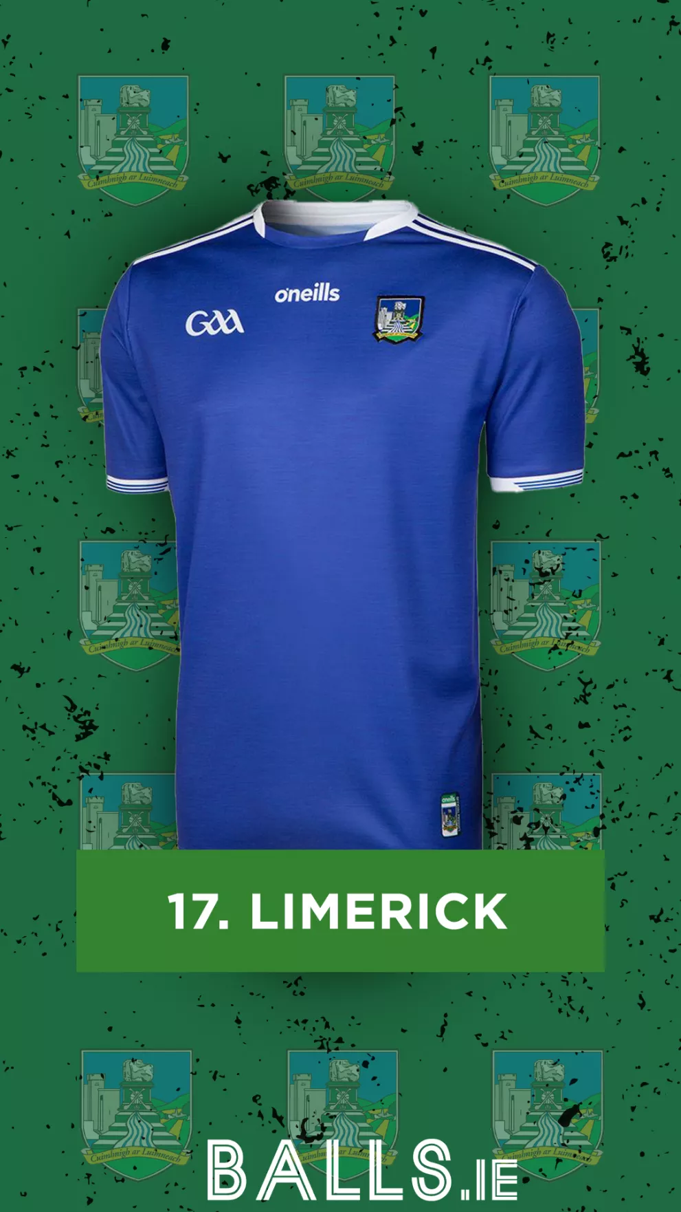
Limerick’s home jersey pulls off the sponsor-less look brilliantly with the darker stripes and undertoned writing, however, their away jersey lacks all of that, giving this one a very, very plain look. It holds some value in the lack of a sponsor, but after using this one for over two years now, a county winning consistent All Irelands needs a better away jersey!
16. Roscommon
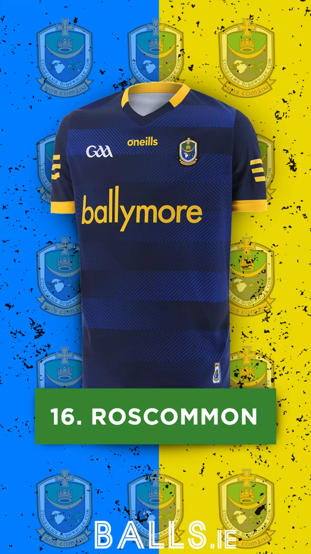
A definite upgrade on their previous awful design. The decision to opt away from primarily using the same shade of blue as their home jersey is a masterstroke, and this dark navy, with blue accents, really works. The sponsor, neck, and sleeve lines all being cohesive adds some bonus points and concludes a solid entry for the Rossies.
15. Tipperary
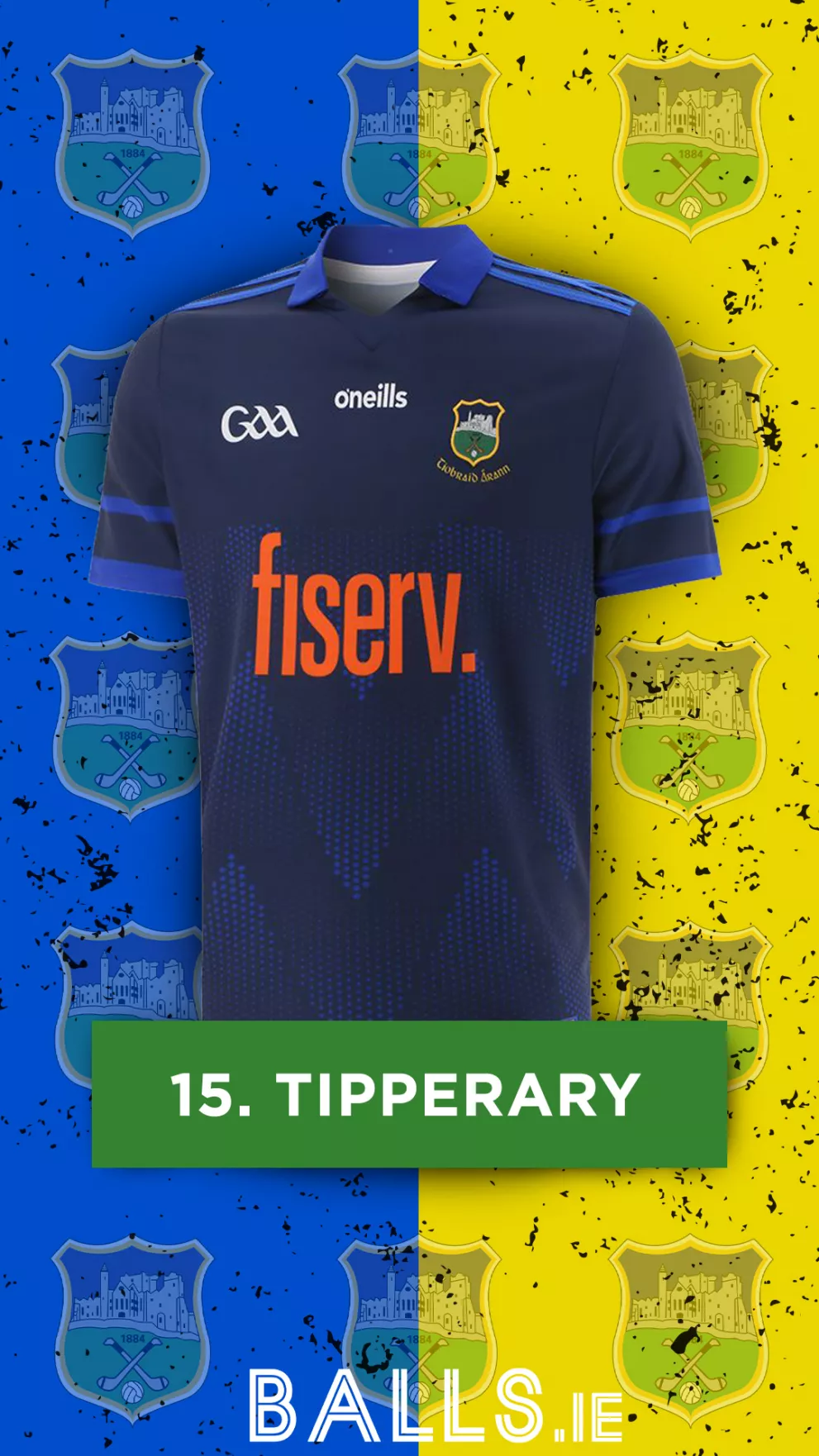
Much like Roscommon, Tipperary have opted for a navy-blue combination, and this one really works. The blue design throughout the shirt combined with the collar and sleeve lines gives this jersey a really complete look and is definitely a step up from their previous grey-geometric pattern entry.
14. Antrim
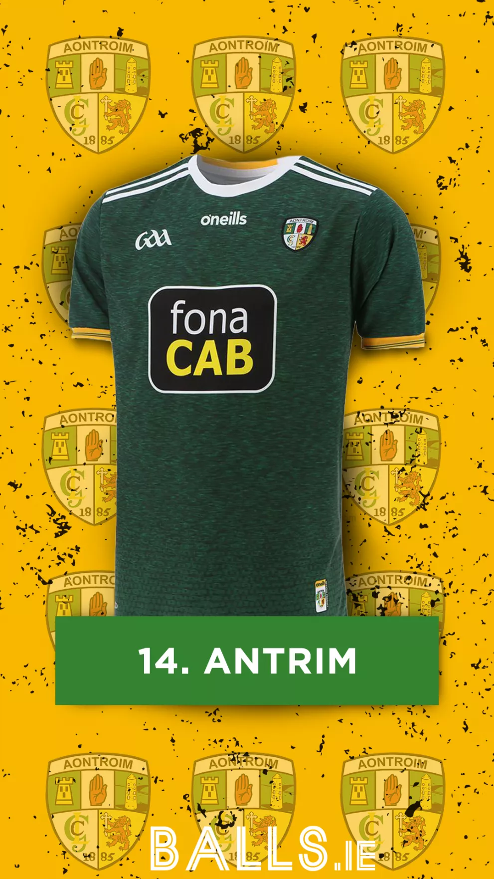
This is a real step in the right direction when compared to their previous colourless jersey. The dark green is complimented by the grain pattern throughout and ties in nicely with the dark green parts of their crest. The white stripes on the shoulders, combined with the white parts of the sponsor and the other logos really brings the whole jersey together.
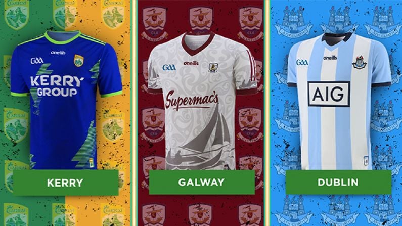
13. Galway
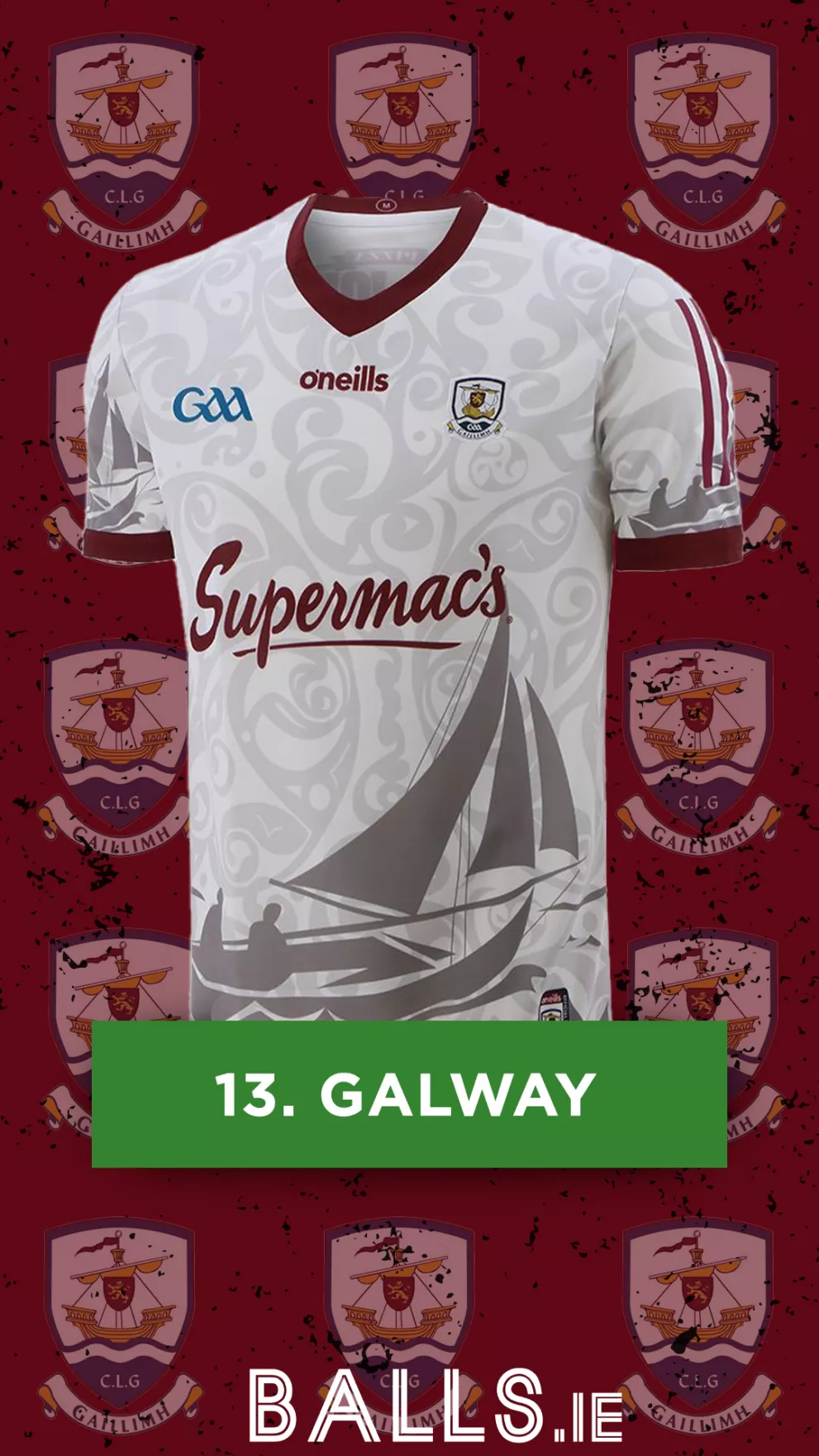
The Celtic pattern really works on this jersey, and saves what could have been a very bland and boring jersey. The presence of the infamous Galway hooker also is a nice touch and once again ties in nicely with their crest. A very solid entry from Galway.
12. Wicklow

Wicklow, like Westmeath, suffered for years with an overbearing and visually unappealing sponsor placement, but having overcome that problem, we find them once again high up in our rankings. This jersey is nice and simplistic but doesn’t fall into the trap of looking overly basic.
11. Kilkenny
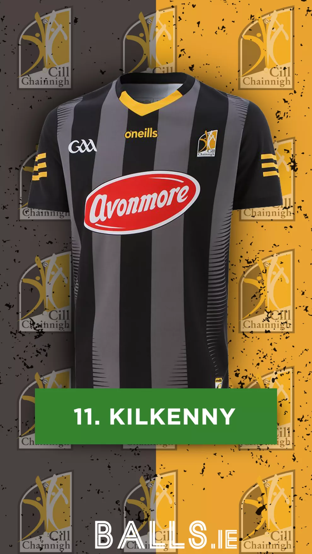
Kilkenny have once again opted for a dark colour combination for their away jersey, and where it has fallen short before, this year proves to be a solid addition! This jersey captures Kilkenny’s traditional stripes, but also doesn’t feel as dull as previous years. The small yellow details also give the jersey the splash of colour it needs to avoid feeling boring, whilst also tying in with their crest and home jersey, a very good effort from the cats!
10. Kildare
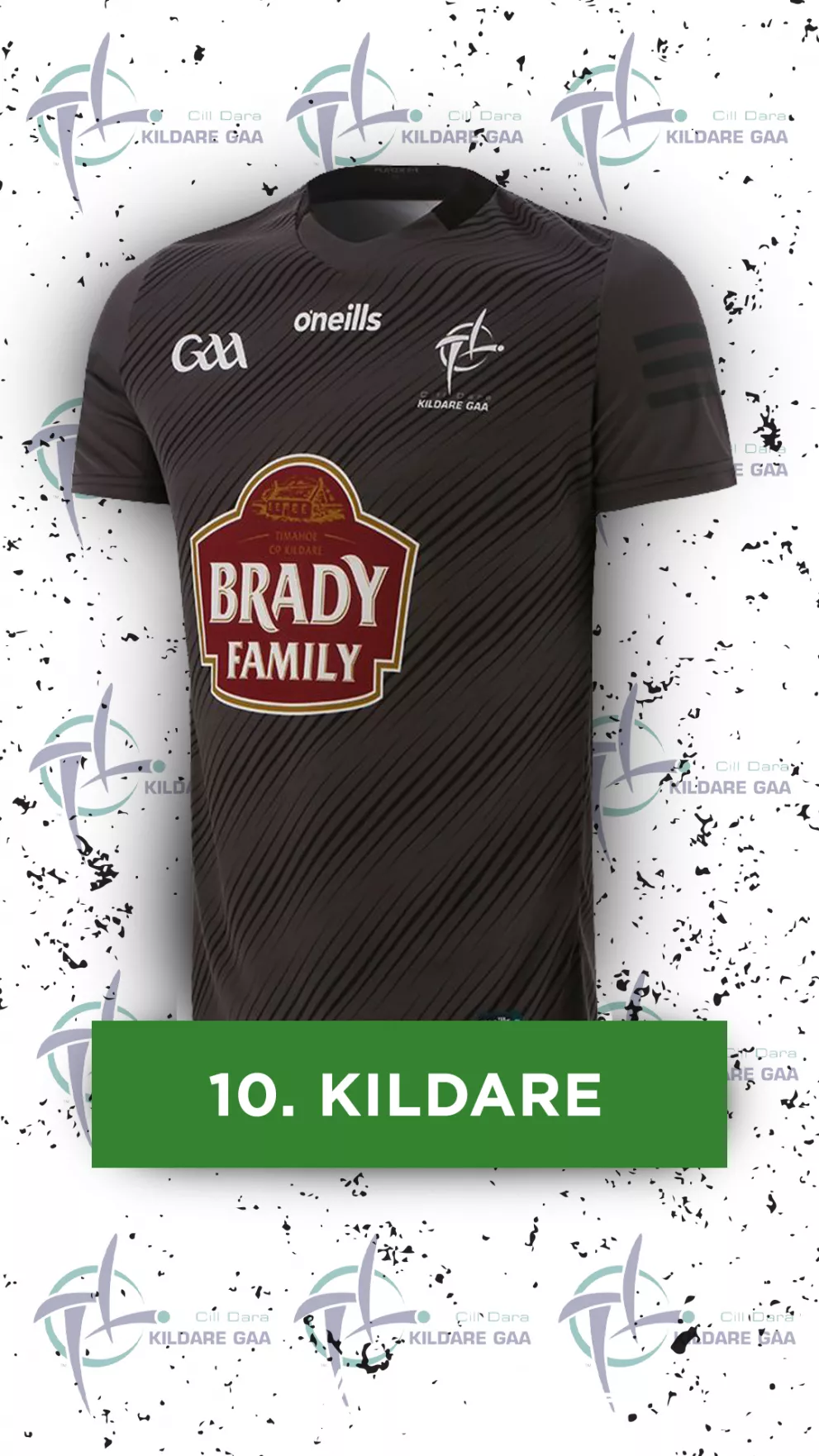
Where the likes of Armagh just fell short for being a little too blacked out, Kildare finds the right balance here. The combination of a very dark grey and black streaks brings the jersey together very nicely and gives some very necessary detail to a jersey that could’ve fallen short of the mark had it not been executed so well.
9. Offaly
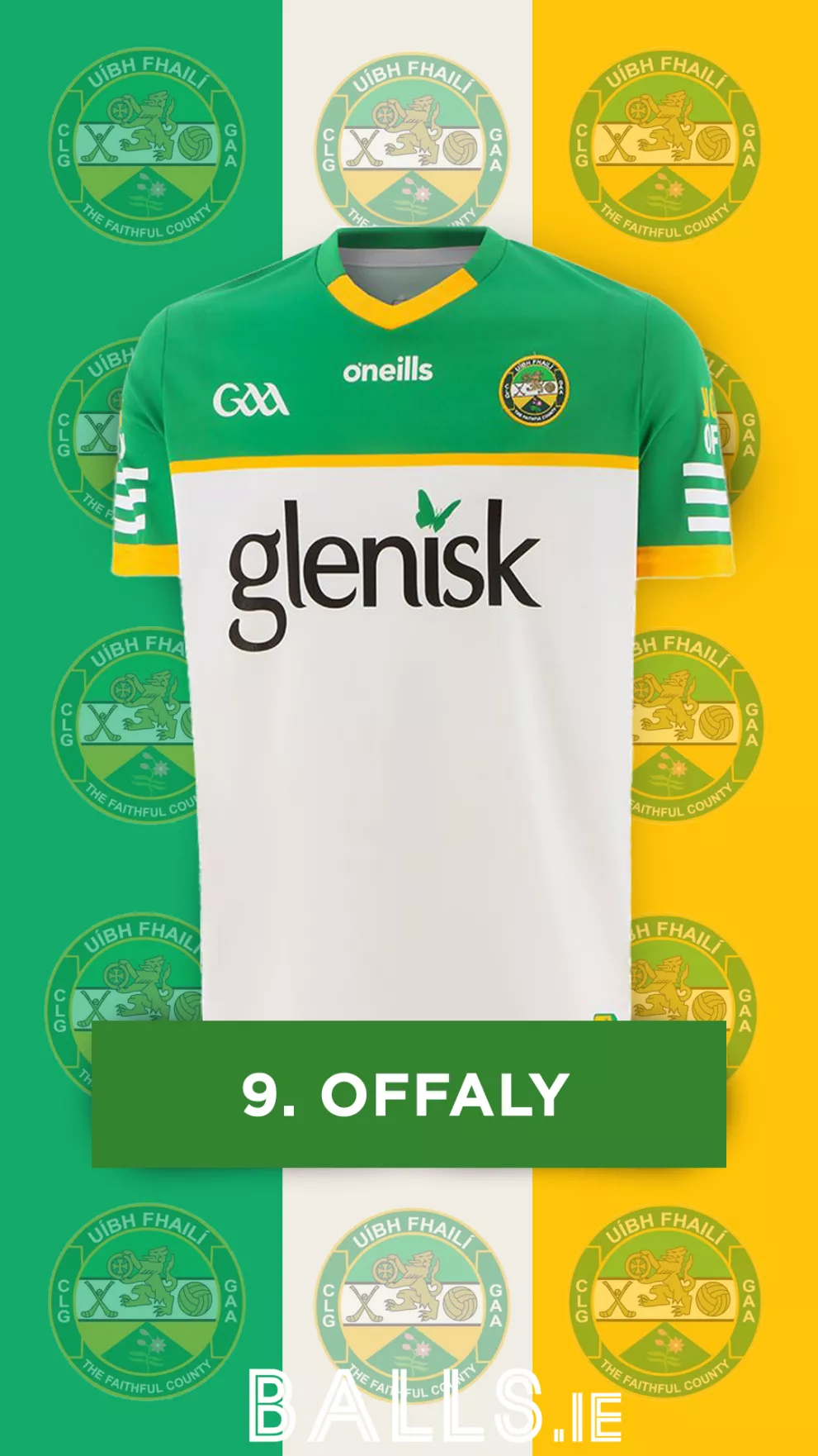
A big jump from last year's rating for Offaly, and well deserved with this year's entry. This jersey feels nicely tied in with their home one, whilst still having enough differences to make it stand out on its own. The coloured section at the top works very well and gives the jersey a very sleek and modern look.
8. Donegal
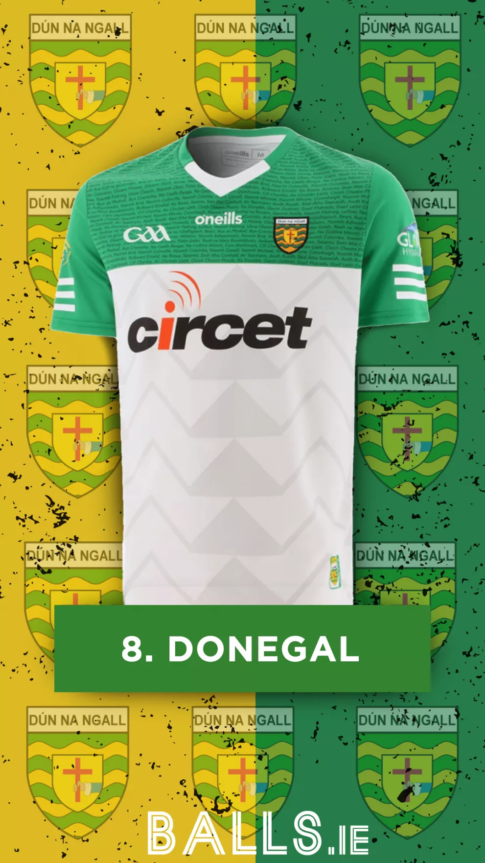
While quite similar to Offaly, we had to put Donegal ahead of them for those little details! Despite being the same template as the home jersey, Donegal opting to use the white in place of the yellow works so well that we had to make an exception! The chevron patterns up the front and the names of all Donegal’s GAA clubs add the vital details needed to avoid the trap of looking too bland that so many have fallen into. A very solid entry from Donegal.
7. Waterford
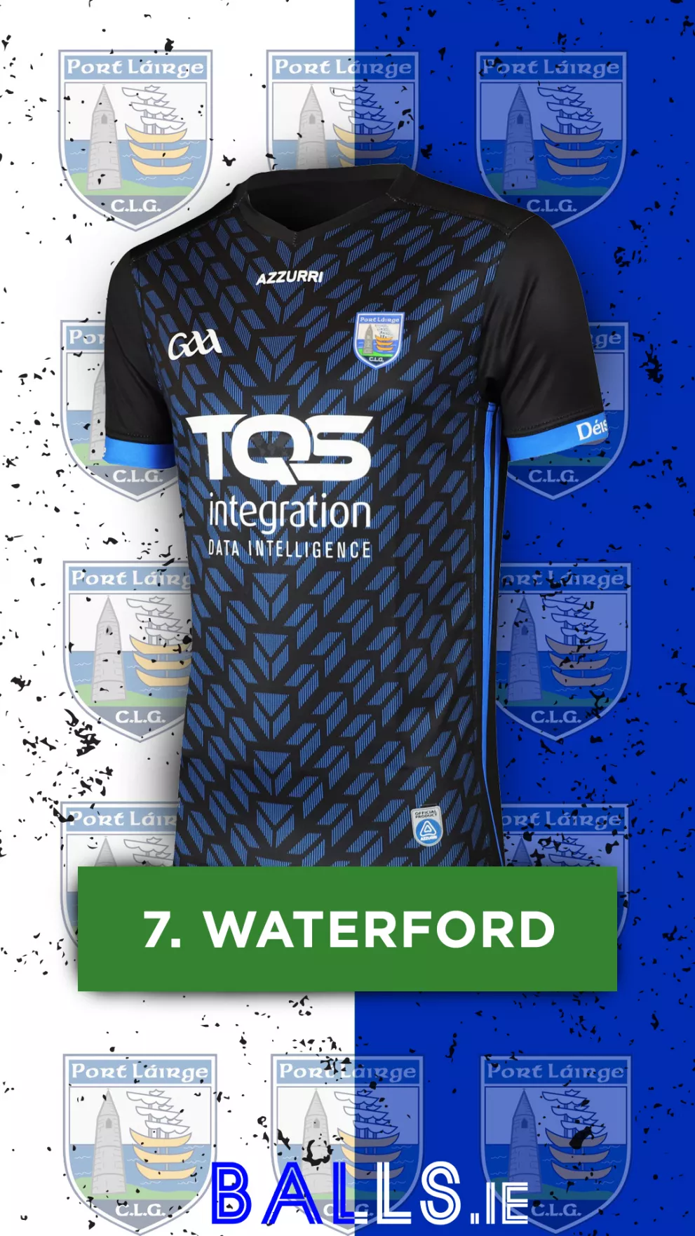
Now that is how it’s done! A massive upgrade on previous entries for Waterford. This year's away jersey is slick, modern, and very visually pleasing! The black base in combination with the blue arrowed pattern is excellent and ties in very nicely with the blue sleeve collars and lines going down the side. A huge step up for The Déise.
6. Louth
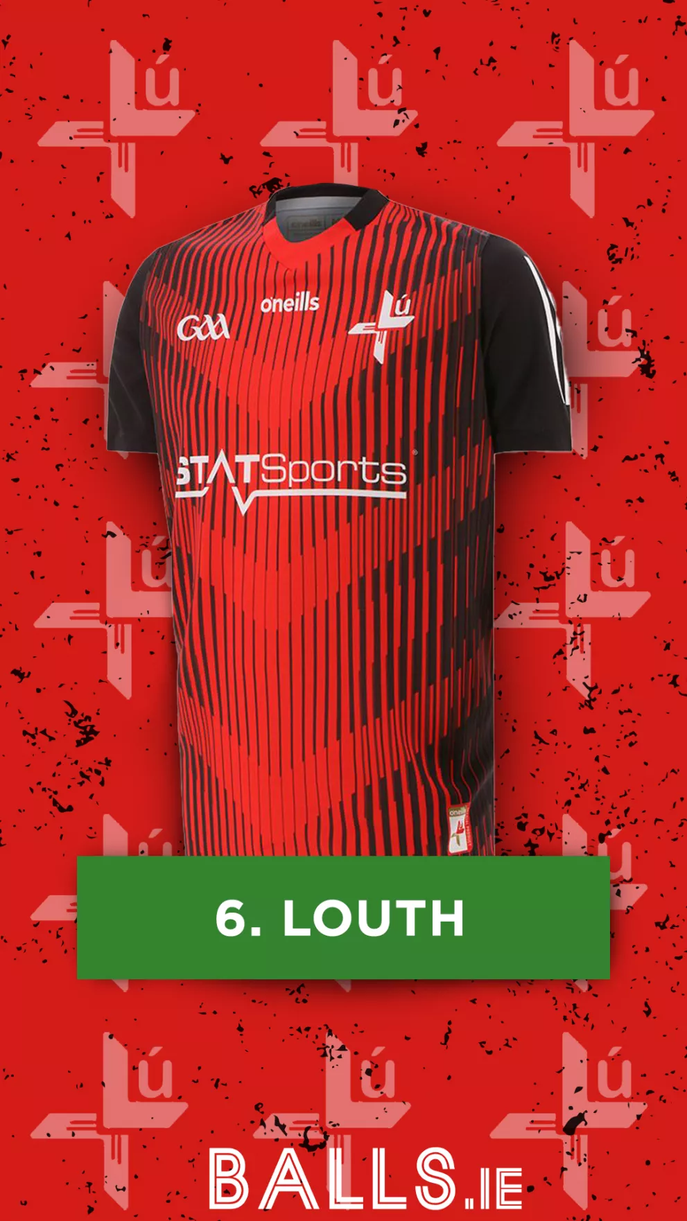
Another great example of how vital the use of a solid pattern is to a jersey. Louth’s away jersey is a perfect blend of getting the colour combination and design choices spot on! The white lines, logos, sponsor and crest tie the whole jersey together in coordination with the striking red and black combination.
5. Cork
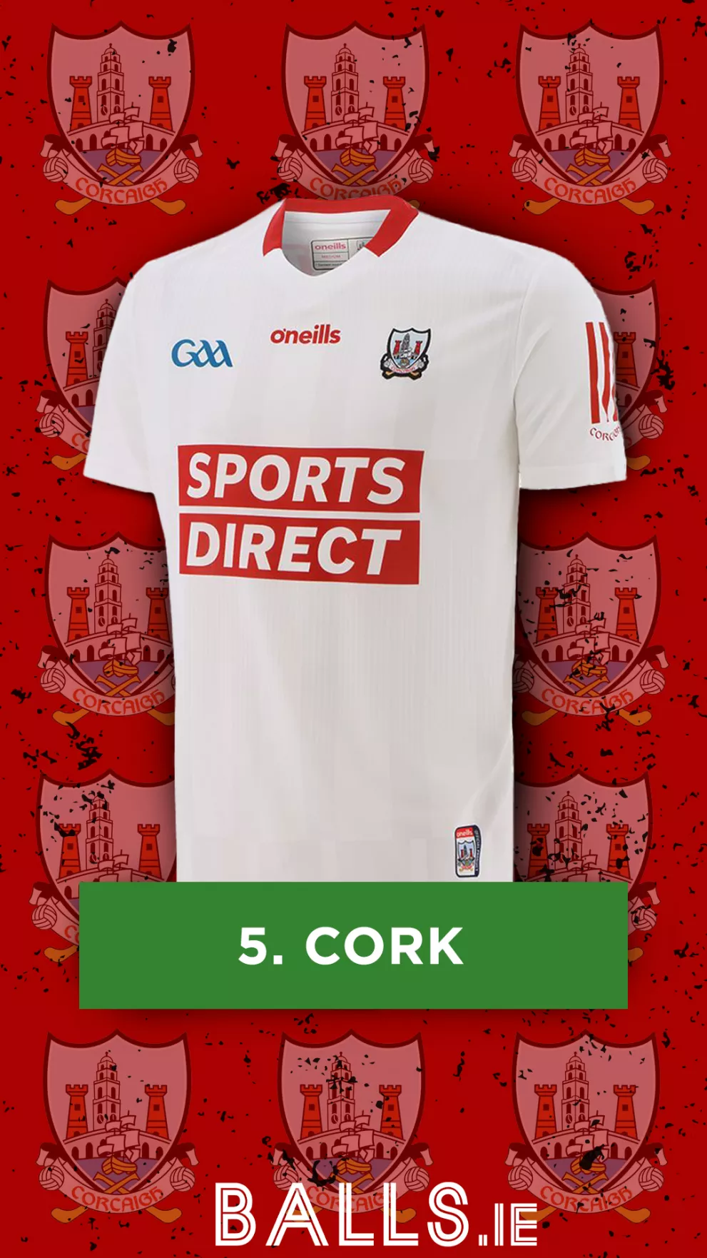
While this one is simple, there’s something classic about it. The red details throughout the jersey contrast nicely with the white base. The slightly darker lines against the white give the jersey some real depth and differentiate it from those with the plain white bases. The blue GAA logo and the blue aspects of the Cork crest also balance the shirt out well and complete a very well brought together jersey.
4. Kerry
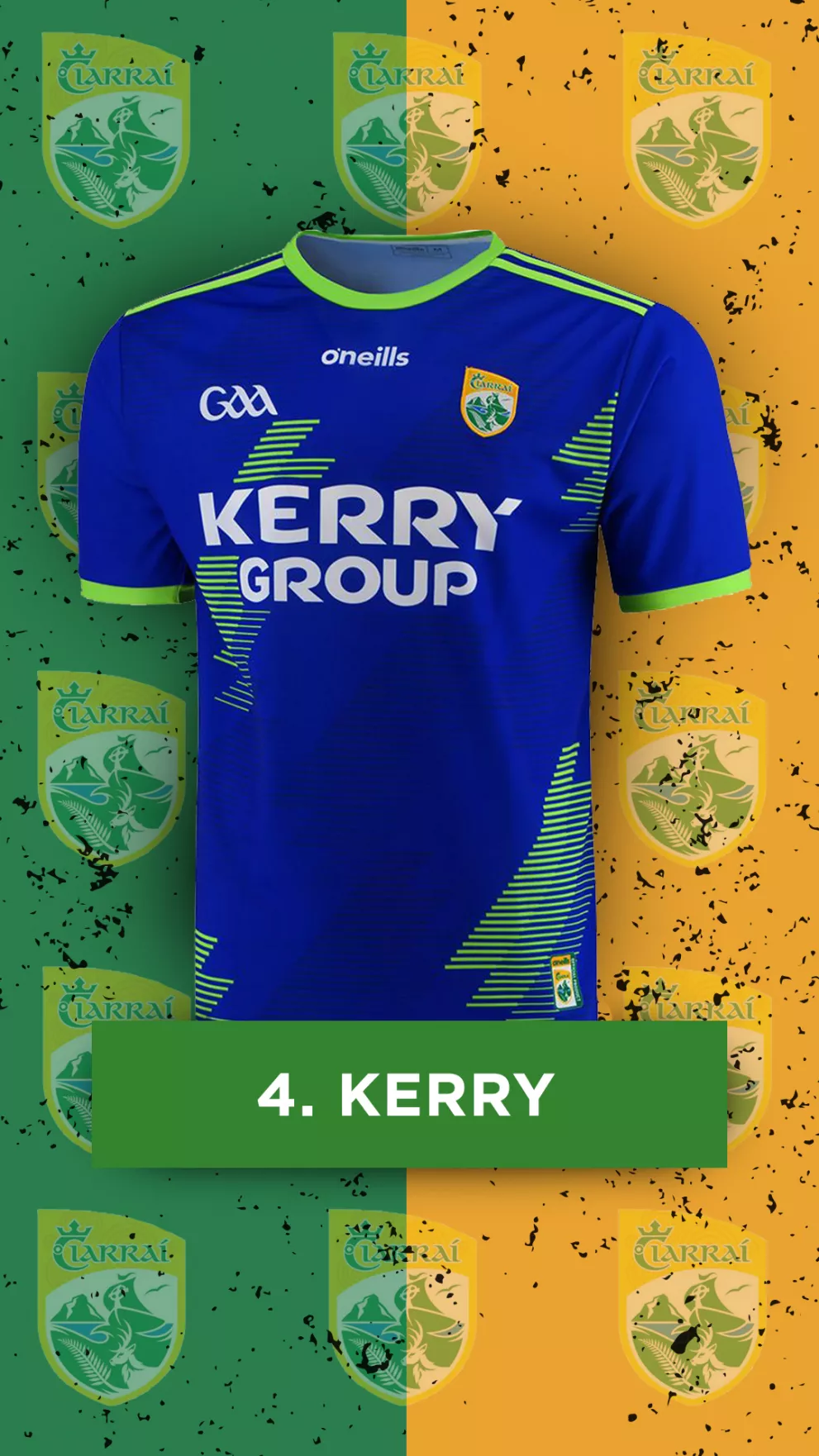
Having seen it for over a year now, this one has really grown on us! This blue and green combination works together very nicely and offers a nice contrast to that of their home jersey. Given how unpopular that one was, Kerry may as well play the All Ireland in this gem!
3. Dublin

A very fresh approach from Dublin this year. This jersey is an absolute masterpiece, from the use of the light shade of blue, to the neck, sleeve cuffs, and sponsor being black, Dublin’s away jersey captures all the right elements needed to create a piece that is unmistakably Dublin, whilst also being different enough from their home jersey to make it stand out on its own!
2. Mayo
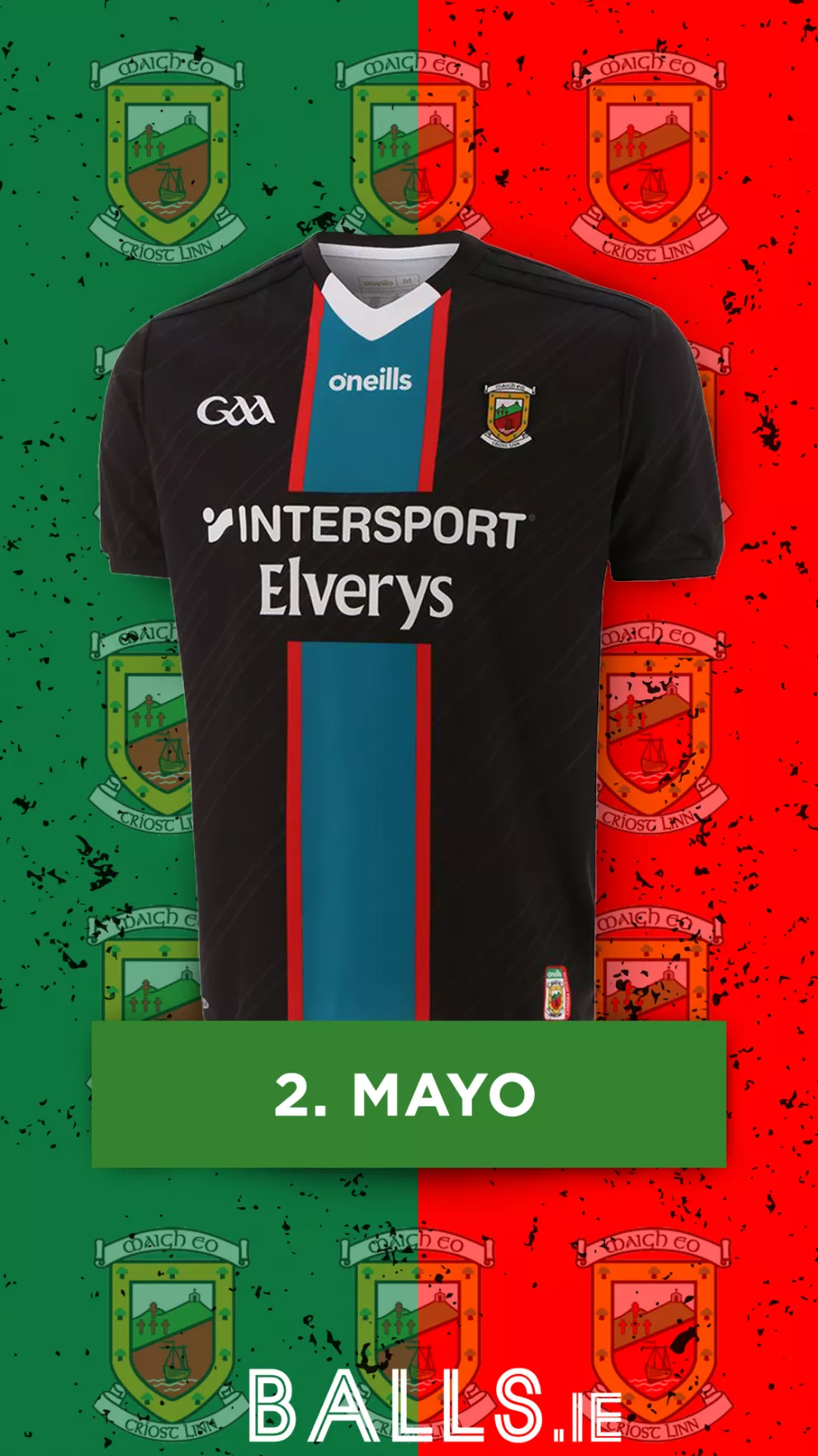
Designed by six-year-old Swinford youngster Aoife Dunne, Mayo’s second year rocking this beautiful away jersey still sees them towards the summit of our ranking. The strips of colour down the front offer the perfect contrast to the patterned black base on the sides of this jersey. Unfortunately for Mayo, this is just as close as they came to winning anything this year!
1. Wexford
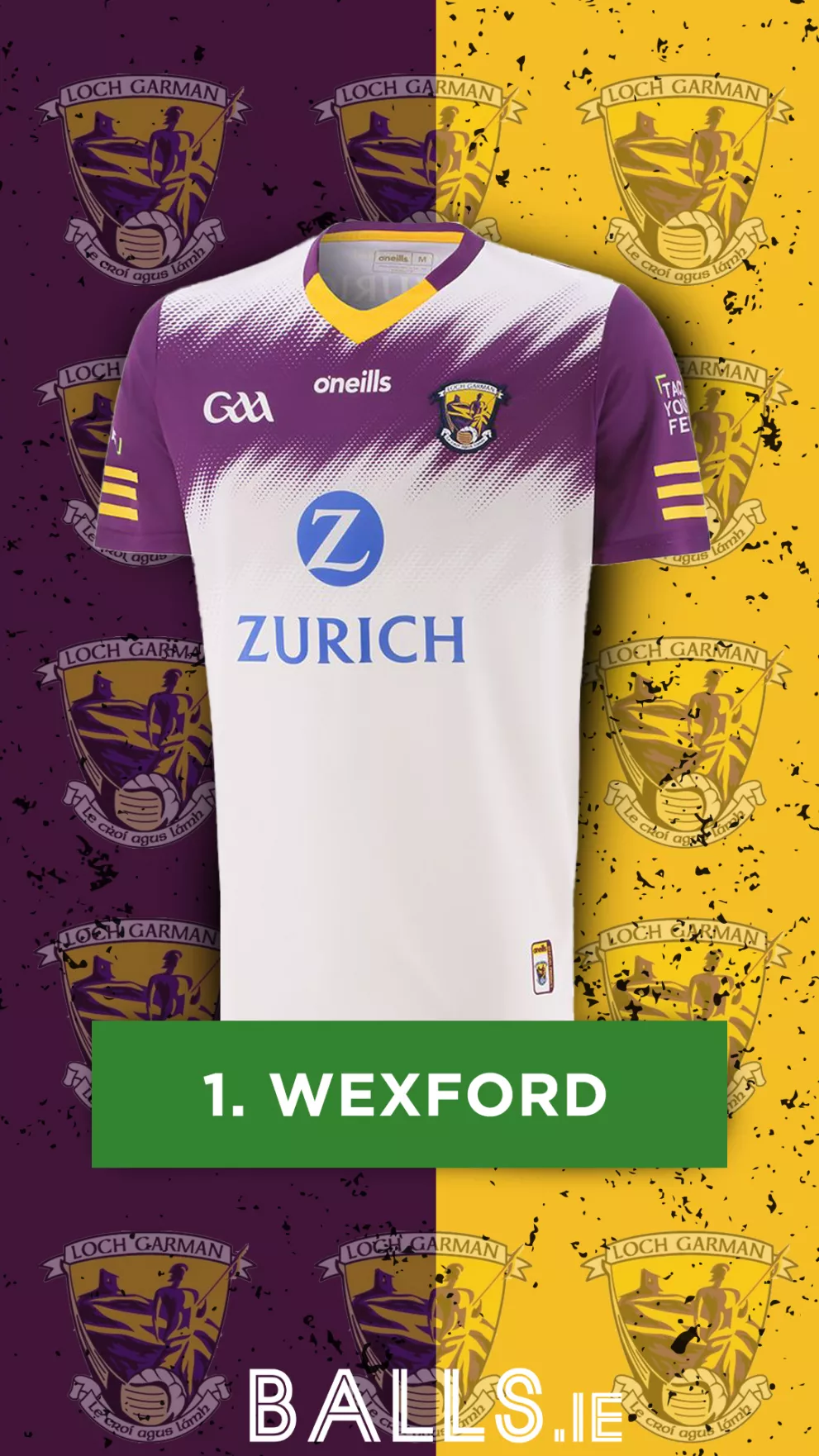
This Wexford away jersey is absolutely perfect! The stylish pattern splitting the white in two is a brilliantly slick and stylish look. The sleeves tying into the chest design is a fantastic addition and adds a level of cohesion to the whole jersey. The neck is the perfect blend of their home colours, whilst contrasting against the white at the top. The sponsor offers a nice contrast to the white base also, and finishes off this brilliant jersey very nicely!